Christina's LIS Rant
Tuesday, May 23, 2006
ARGH! One interface really can't fit all audiences...

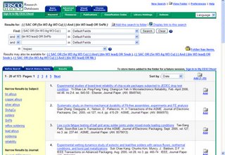
I initially mentioned in passing that I had some concerns with the EbscoHost implementation of faceted search. I will now proceed to rant on the subject.
They've designed one interface to be used for everything from MasterFile Premier (for public libraries) to Inspec. I use Inspec via EbscoHost and here are big issues
1) They group DE and ID -- non-librarians won't know the terms but they will suffer for this. In the facet on the left hand side, the terms are not orthogonal and can be a bit bizaare. That's because you have identifiers or, as they say, "key phrases" stuck together with the controlled vocabulary. This is really misleading because you won't know which is the preferred term that will get you all the hits. Also, you only get 10.
2) The spelling suggestions are bizarre -- they must have bought them off the shelf from someone instead of taking them from the words actually appearing in the database. They thought Snob would work better than Sn-Pb -- in Inspec, for heaven's sake.
3) We're supposed to figure out that we can remove the narrowing terms by clicking on the link for the term prior. I dunno, anyone guess this or watch the tutorial?
I'm glad that they're working on the interface and adding cool things, but they really aren't there yet. Notice we have more than one facet, too. I think our local admin had to turn that on because the default was to offer only one facet. Sigh.
Yeah, I get why it's nice to have a standard interface, but the things available through it are so extremely different from each other, that there really needs to be more customization for the audience and the quality of the metadata in the database. Some databases don't have decent fields and quality data to work with, but Inspec does.
Comments:
Christina,
My name is Will DeBouver and I am the Database Sales Manager for Elsevier, working closely with Brian Prentice, the account manager. I understand you would like to take a look at INSPEC on the Elsevier based EV platform. I can set up a trial, provide pricing, or what ever you would like. Since I did not have your contact information, I am posting a message on your board, with my contact information. You can reach me directly at 678-342-8233 or at w.debouver@elsevier.com. I look forward to speaking with you.
Kind regards,
Will
Post a Comment
My name is Will DeBouver and I am the Database Sales Manager for Elsevier, working closely with Brian Prentice, the account manager. I understand you would like to take a look at INSPEC on the Elsevier based EV platform. I can set up a trial, provide pricing, or what ever you would like. Since I did not have your contact information, I am posting a message on your board, with my contact information. You can reach me directly at 678-342-8233 or at w.debouver@elsevier.com. I look forward to speaking with you.
Kind regards,
Will


